
Branding, logo and editorial design
Wine label Design
As a wine lover I had never had the occasion to design a brand in this regards, so I decided it was time to do it. I went to a few wine shops and picked a label that in my opinion was not very interesting so I could do a redesign of the same.
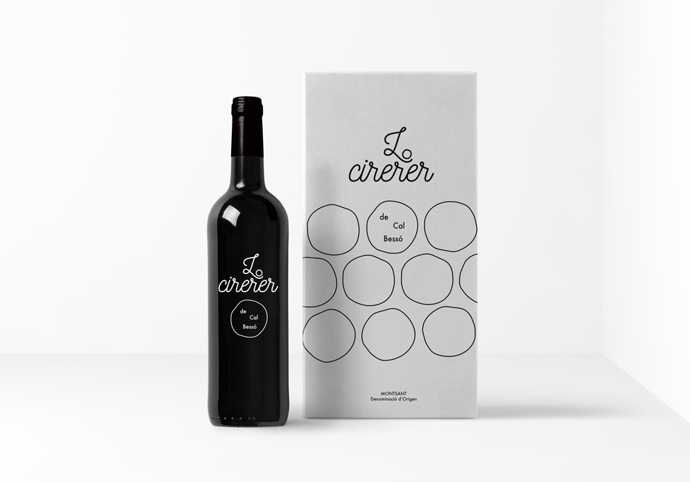
The wine that I picked is called Lo Cirerer, which means Cherry. It is produced in Catalonia, with a low to medium production and an affordable price. The target is the hipster population, a young generation interested in wine, that would be easily inspired by a good, modern design.
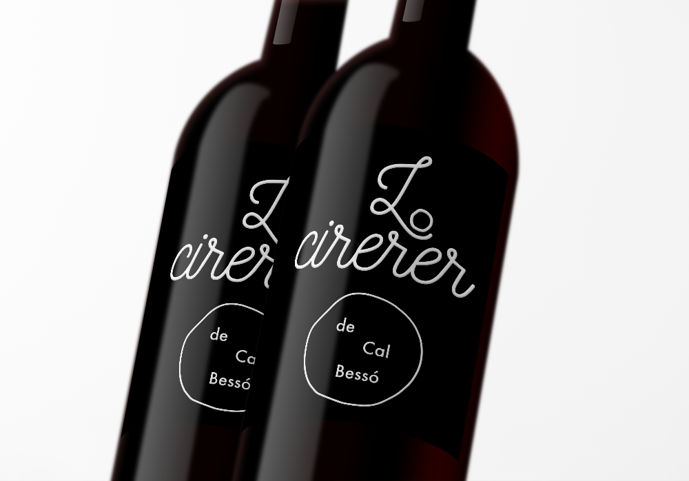
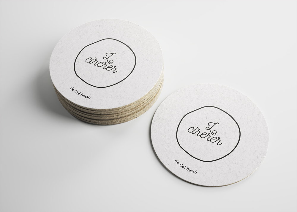
The contrast between the black and white, the modern typography and the simplicity of the cherry, were a perfect combination for the look I was aiming for: minimal, clean, easy to remember and attractive.
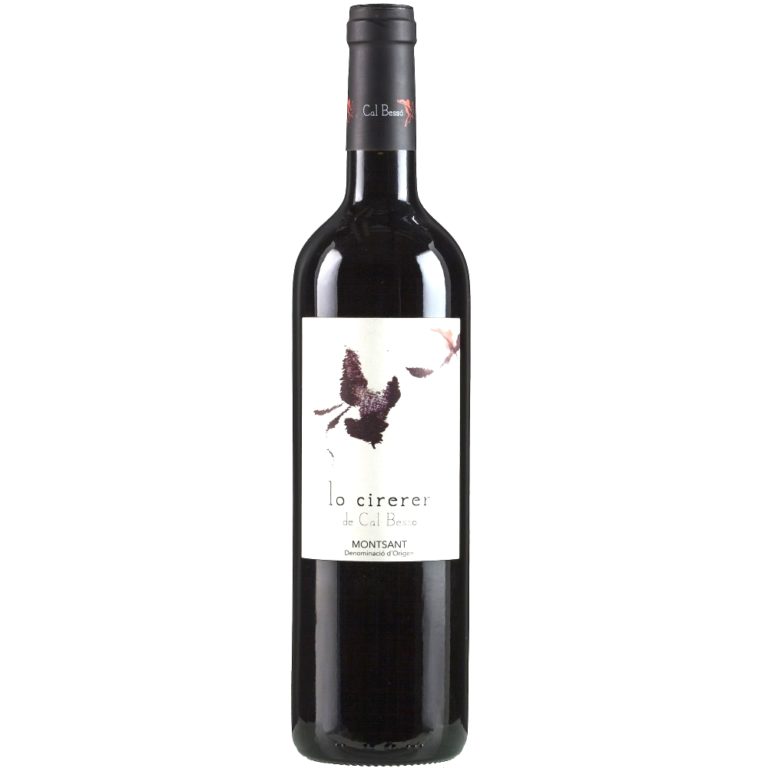
![]()
@ Lo Cirerer current branding
![]()
The following is the design I suggest.
![]()